
New Look Inspired by Nature
This is a very special guest blog post from the designer creating the look inside new Trianon, Emily Basham-Hoelscher the Founder and Principal Designer at High Contrast Design House. You can follow her on Instagram @highcontrastdesignhouse
When I first met with Stacy, I asked her the origin of the name Trianon. She explained to me that it was named after Le Petite Trianon - the garden home at Versailles. She said that what she personally took from the name was the notion of a tree - a place that is relaxing and provides a protective canopy - and that long ago the shop employees had even nicknamed it “The Tri”. So I took that and ran with it.
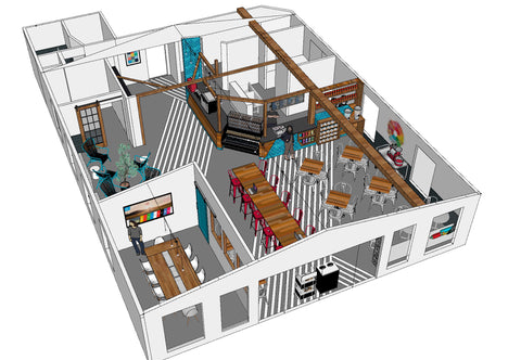
There are several distinct areas to hang out in the space:
- The dining area is typical tables and chairs, to have a meal or a quick catch up with friends.
- The communal workspace is a bar-height table where you can work away on your laptop with coffee and a snack.
- The lounge is where you can come and truly relax - and moms can hang out while their kids enjoy the play area.
- And the group room is a private space for meetings and group discussions for up to 10 people.
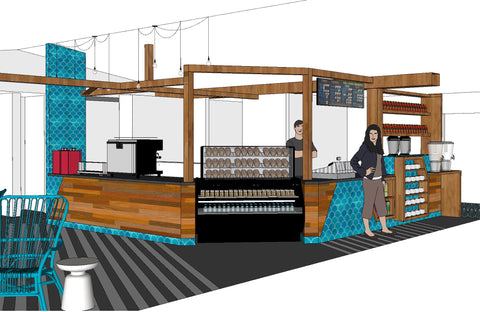
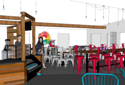
For the design concept, we wanted to use the inspiration of a tree, but in a much more graphic and abstracted way. The idea of the tree starts at the counter, with wood beams that stretch out like an abstracted canopy over the kitchen and across to the lounge.

At the lounge, the geometry of the branches meets the custom shelves for merchandise that have the appearance of abstracted trees as well. I added some geometric striping on the floor to connect the spaces and provide a visual path, and also to represent the shadows of the tree branches.
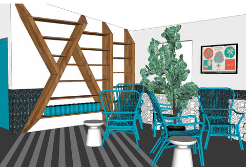
Concrete breeze blocks are used to emphasize all the graphic geometry, as well as provide great texture. They create a banquette seating area at the front of the shop, and create planters - where we will grow real coffee plants! - in the lounge.
We wanted to create a fresh brand color palette for the space - one that would be bright, modern, and fun. The gorgeous, handmade aqua tiles sourced locally from Clayworks represent the rain that feeds the tree, and the rounded shape is a great contrast the the geometric angles of all the wood. Aqua became our primary brand color, with the secondary colors being pops of red - representing the fire of roasting the coffee, green - representing the leaves of the tree and of the coffee plants, and orange - representing the sun.

This new space is a huge new start for Trianon, so we went BOLD while still making it a cozy space where you will want to just hang out for hours. I hope you love the new Tri-House!
Emily Basham-Hoelscher
Founder + Principal Designer
highcontrastdesignhouse.com
445 comments
I was recently scammed out of $53,000 by a fraudulent Bitcoin investment scheme, which added significant stress to my already difficult health issues, as I was also facing cancer surgery expenses. Desperate to recover my funds, I spent hours researching and consulting other victims, which led me to discover the excellent reputation of Capital Crypto Recover, I came across a Google post It was only after spending many hours researching and asking other victims for advice that I discovered Capital Crypto Recovery’s stellar reputation. I decided to contact them because of their successful recovery record and encouraging client testimonials. I had no idea that this would be the pivotal moment in my fight against cryptocurrency theft. Thanks to their expert team, I was able to recover my lost cryptocurrency back. The process was intricate, but Capital Crypto Recovery’s commitment to utilizing the latest technology ensured a successful outcome. I highly recommend their services to anyone who has fallen victim to cryptocurrency fraud. For assistance contact Recoverycapital@fastservice.com and on Telegram OR Call Number +1 (336)390-6684 via email: Capitalcryptorecover@zohomail.com you can visit his website: https://recovercapital.wixsite.com/capital-crypto-rec-1
Hello Everyone !
FRESH FULLZ FRESH W2 FRESH UK & CANADA STUFF FRESH DL&PASSPORT PHOTOS
Fullz available in bulk USA UK CANADA #SSN #NIN #SIN
Leads Available of All types
Forex|Crypto|Casino|Investors|Gamblers|Sweepstakes|Health Insurance
Bulk Quantity Available
DL-Photos & Passport Photos with Selfie all over the world
High CS Pros 700+ Scores Available
W-2 Forms 2025 Available for Tax Refund
KYC stuff Available
USA LLC Doc’s Available with SSN & DL
Business EIN Company Pros Available
CC with CVV & Billing Address
*Many Other Stuff Available
*Very Fresh & Valid stuff
*You can visit our channel as well for the list of stuff we’re providing
Here We’re :
====
Telegram Channel – t.me/leadsproviderworldwide
TG User @ killhacks – @ leadsupplier
What’s App – (+1) 727’’’788’’’6129
Discord – @ leads.seller
VK Messenger – @ leadsupplier
Signal – @ killhacks.90
Email – hacksp007 at gmail dot com
Zangi – 17-7369-4210
https://about.me/gilberthong
*We’re also providing AI Stuff (Tools|Learning Stuff|AI Bots)
*Hacking & Spamming Stuff available with All tools & Tutorials
*You can get our stuff & use them to make money & also for polish your skills
Fullz Info:
===
USA= name ssn dob dl-number address mmn phone email employee & bank info
UK= name sin dob dl-number phone email bank name sort-code & account number
Canada= name sin dob dl address phone mmn
*Germany, Spain, France, Australia Fullz Available
*DL, ID, Passport, Visa Photos available
AVAILABLE LEADS STUFF LIST:
=======
-Casino & Gamblers Leads
-Forex, Crypto & Crypto Investors Leads
-Health Insurance & Medical Leads
-Medicare Leads with Medicare ID
-SweepStakes Fresh & Active
-Investors Leads
-Job Seekers Leads
-Payday Leads
-Mortgage Leads
-Doctors Database with Specialty Leads
-Cars Database with VIN Numbers Leads
-Loan & Bank Leads (account & routing)
-EIN Company Leads USA
-Gmail, Yahoo, Hotmail, AOL, Office365 Leads
-Education Leads
-Mixed Domain Leads (.eu, .ca, .uk, etc.)
-CFO & CEO Leads
-Banking Leads
All info will be provided Fresh, Active & Genuine
Many Other stuff we can provide
Just tell us your demand & we’ll provide our best
#Leads #casinoleads #cryptoleads #fullz #usafullz #taxrefund #sweepstakes #cryptoleads
#fullzuk #canadaleads #cvvshop #forexleads #ssnfullz #kycstuff #usadlphoto
#aitools #aibots #AI #freshfullz #emailleads #cryptopayments #btc #eth #s&p500 #gold #silver
#taxrfund2026 #w2forms #usataxrefund #facebook #meta #trump #youtube #gmail #grok #gemini
How To Recover Your Bitcoin Without Falling Victim To Scams: A Testimony Experience With Capital Crypto Recover Services, Contact Telegram: @Capitalcryptorecover
Dear Everyone,
I would like to take a moment to share my positive experience with Capital Crypto Recover Services. Initially, I was unsure if it would be possible to recover my stolen bitcoins. However, with their expertise and professionalism, I was able to fully recover my funds. Unfortunately, many individuals fall victim to scams in the cryptocurrency space, especially those involving fraudulent investment platforms. However, I advise caution, as not all recovery services are legitimate. I personally lost $273,000 worth of Bitcoin from my Binance account due to a deceptive platform. If you have suffered a similar loss, you may be considering crypto recovery, The Capital Crypto Recover is the most knowledgeable and effective Capital Crypto Recovery Services assisted me in recovering my stolen funds within 24 hours, after getting access to my wallet. Their service was not only prompt but also highly professional and effective, and many recovery services may not be trustworthy. Therefore, I highly recommend Capital Crypto Recover to you. i do always research and see reviews about their service, For assistance finding your misplaced cryptocurrency, get in touch with them, They do their jobs quickly and excellently, Stay safe and vigilant in the crypto world. Contact: Recoverycapital@fastservice.com You can reach them via email at Capitalcryptorecover@zohomail.com OR Call/Text Number +1 (336)390-6684 his contact website: https://recovercapital.wixsite.com/capital-crypto-rec-1
FRESH FULLZ UPDATED-2026 AVAILABLE
USA UK CANADA GERMANY SPAIN ITALY AUSTRALIA
Tax Return 2026 Filling Fullz
Children Fullz 2011-2023
Young & Old Age Fullz 1930-2009
High Credit Score 700+ Scores
DL & ID Photos Front Back with selfie
DL Photos available all countries
Passport Photos
W-2 Forms with DL Photo (2021-22-23-24-25)
USA LLC Docs with DL & SSN
USA→ Name SSN DOB DL Address City State Zip Phone Email Employee & Bank Info
UK→ Name NIN DOB DL Address City State Postcode MMN Account number Sort Code
Canada→ Name SIN DOB DL Address City State Zip Phone MMN
Many Other Countries Fresh Fullz available in Bulk quantity
All Info will be provided with guarantee
Tax Filling Tools & Tutorials available
Our Team Is working 24/7 & here we’re:
-—————————————————-
Telegram@killhacks – @ leadsupplier
What’s App – (+1) 727’’’788’’’6129
Telegram Channel – t.me/leadsproviderworldwide
Discord – @ leads.seller
VK Messenger – @ leadsupplier
Signal – @ killhacks.90
Email – hacksp007 at gmail dot com
Zangi – 17-7369-4210
Email Leads & phone number Leads
Crypto, Forex, Investors Leads
Payday & Loan Leads
Doctors Database, Health & Medical Leads
Car Database with Reg Numbers
Email & Pass Combos
Office365 Leads & Logins
Crypto Exchanges Leads
LinkedIn, Facebook, Instagram Leads
Education & School Leads
TOOLS & TUTORIALS AVAILABLE
H@cking Sp@mming C@rding Sc@M Pages Scripting Tools
Complete packages for Sp@mming & Ph!shing Attack
Sqli Injectors & Pen3tratrion Tools with tutorials
SMTP Linux Root & Sc@m Page Scripting
C@rding Tools & Tutorials (For CC|CVV Cash out & Dumps)
We are also providing complete packages for the above listed stuff
Complete guidance & assistance will be provided
Just try our services, we’ll give your best
#fullz #usafullz #canadafullz #ukfullz #taxreturn2026 #usataxreturn #dlphotos
#personalID #leads #taxfillingfullz #usataxfilling #childrenfullz #trumpiran #indiarussia
#chinausa #usachina #MAGA #Btc #btcbullrun #cryptocrash #cryptobill #eth #altseason
*Be aware from the scammers using our cloned names
Bitcoin Recovery Testimonial
After falling victim to a cryptocurrency scam group, I lost $354,000 worth of USDT. I thought all hope was lost from the experience of losing my hard-earned money to scammers. I was devastated and believed there was no way to recover my funds. Fortunately, I started searching for help to recover my stolen funds and I came across a lot of testimonials online about Capital Crypto Recovery, an agent who helps in recovery of lost bitcoin funds, I contacted Capital Crypto Recover Service, and with their expertise, they successfully traced and recovered my stolen assets.
Their team was professional, kept me updated throughout the process, and demonstrated a deep understanding of blockchain transactions and recovery protocols. They are trusted and very reliable with a 100% successful rate record Recovery bitcoin, I’m grateful for their help and highly recommend their services to anyone seeking assistance with lost crypto.
Contact: Capitalcryptorecover@zohomail.com
Phone CALL/Text Number: +1 (336) 390-6684
Email: Recoverycapital@fastservice.com
Website: https://recovercapital.wixsite.com/capital-crypto-rec-1